Αrt3054 Πεμπτη 30 Μαρτίου 2017
How Google Branded Tech’s Next Big Paradigm
Daydream is the first decent VR brand. And that’s because it was inspired by nature, not technology.
1/8 [Image: Google]
BY MARK WILSON
Facebook called it “the Oculus,” a throwback to ancient, Byzantine architecture. HTC chose “the ive,” the sort of pseudo-word that sounds like it was born from a New York ad agency.
But Google? Google named its virtual reality headset “Daydream.” And in doing so, it created a foundation for the first decent virtual reality brand. It’s both a signifier and a definition of itself in one. How do you explain what an Oculus headset is to grandma? You can’t. A daydream, however, anyone can understand.
It may come as no surprise that the Daydream name wasn’t brainstormed by your typical branding agency. As Google told me, in the company’s first interview on the Daydream brand since it launched at Google IO, it was actually the internal code name used by developers. The daydream was, in essence, how the design team conceptualized the experience they wanted to build—a bit of whimsy accessible to anyone, that could be slipped on and off at a moment’s notice.
Joshua To, who led the branding as design manager at Google VR and AR UX, was a big proponent of keeping the project’s code name intact. The challenge was figuring out Daydream’s visual branding, from its logo to its UX. What does a daydream really look like, anyway?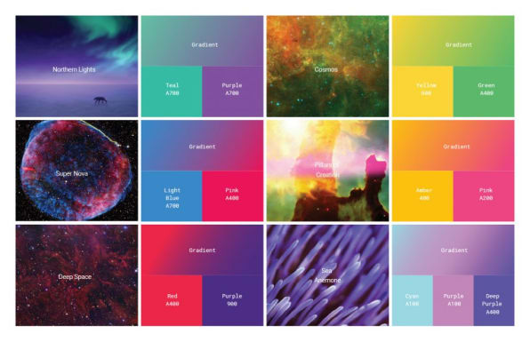 [Image: Google]
A BRAND DESIGNED FOR VR
Daydream’s virtual world is inspired by the natural one: The platform’s interface is designed as a series of idyllic landscapes that serve as portals to games and apps. To brand it, To’s team drew inspiration from a broad and unlikely array of sources—from pinecones to pop art.
“We watched a lot of Drake music videos,” he says. His team was trying to solve a particular problem with Daydream’s identity—not just how to brand VR, but how to create a brand mark that could function in both the 2D and 3D worlds. Google’s own Material Design rules offered some guidance, but not enough, because ultimately, Material Design is meant to live on a 2D screen. Drake’s “Hotline Bling“‘s immersive color-fields seemed to break all dimensional bounds.
They wanted Daydream’s logo mark to feel ephemeral and spatially rich in the same way—but also natural. That led them to the mathematics of nature itself. “It sounds almost a little bit cheesy, but some of the most beautiful things in the world are natural things. We’d go on nature walks, look at pinecones and flowers,” says To. “We did this period of a week where we geeked out about the golden mean, and printed out seed formations, nautilus, etc. Then it was like, oh my god!, the Fibonacci numbers!”
Many believe Fibonacci sequences—simple mathematical progressions in which each new number is made of the sum of the two that came before it—are the common thread of the cosmos itself, the equations that connect flowers to galaxies to art to architecture. You may also know it as the golden ratio or golden mean. Its scientific validity has been disputed, but there’s no doubt that it appeals to the human eye—photography, films, and paintings have followed the rule of thirds as long as they’ve each existed.
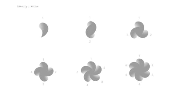 [Image: Google]Based on their research, the team began sketching several spiraling golden ratios as one figure, circumscribing them around one another—2, 3, 4, 5, 6, and up to 7 at a time. The resulting shape seemed to spin, a graphic representation of nature’s math repeating itself again and again.
They began to call the logo the “Eon”—a name To liked because it had significance in astronomy and geology, tying the brand back to its natural roots. Indeed, a billion years is the sort of time scale that we only talk about in reference to nature. And yet, there’s an uncertainty to the word. Aside from a strict billion years, eon is also defined as an “indefinite and very long period of time” by another definition—an ethereal time stamp on something momentous.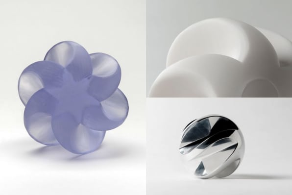 [Photo: Google]
A LOGO YOU CAN TOUCH, THROW, AND FEEL
The logo had to look good in all dimensions, of course, but Google had bigger plans for it. The Eon would one day become a way to touch Daydream. It might be an object a player would throw to open a portal in VR, or collect to unlock special bonuses in a game. It had to have presence.
Testing and tweaking involved looking at it on computer screens and through VR headsets—as well as lots of 3D printing of physical models, with which the designers would subtly tweak the geometry, color, and even materials ranging from aluminum to clear polycarbonate.
How Google Created The Daydream Brand.
“We’ve done some [digital] tests. We have a bunch of demos that allow you to pick up an Eon, throw it as far as you want. There’s ones that bounce, ones that are heavier. We did early explorations asking, is this a fun object to interact with?” says To. “There’s also the physical corollary, too. We had tons of these things 3D-printed, so people are using it as fidget balls in meetings. Throwing it around, playing with it. That gave us a lot of physical prototyping and research as well.”
In VR, they set up entire virtual rooms full of various Eons of different sizes and shapes, allowing designers to walk up to them and inspect each under different lighting conditions. Additionally, they tested how the logo could work in motion—without making the viewer vomit. Given that the Eon appears whenever you load Daydream, that would be a lot of motion sickness.
“If you’re animating the logo really closely to someone’s face, and you move the camera on them, and jerk it, it can make them really sick,” says To. “But the more relevant thing is, [VR] is the first time that brands could really violate your personal space. How close can a logo be to you? Generally, with your interaction with brands today, you get to decide how close they get. Or a swoosh on shoes.”
 [Image: Google]
SKEUOMORPHIC BRANDING
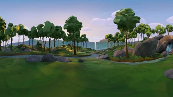
Daydream is a virtual experience that’s anchored in the natural world. When you load it, you don’t appear in the West Elm catalog that is the Oculus Rift waiting room, nor do you appear in the soulless, white Matrix load-out screen that is found on the HTC Vive. You appear inside a forest or a cave, to load your first VR app. And if you choose to look at art? Google will place you inside a gallery that’s flooded with (simulated) natural light.
In that sense, Daydream’s branding extends from a logo into its user interface. Slipping on a Daydream headset and exploring a virtual world should look and feel as natural as going on a hike.
“The reason why, in human history we’ve built houses and shelters is not that nature is ugly, but the elements can be kind of fierce sometimes,” says To. “VR at least now unlocks a bit of the possibility of environments you can be in that are safe, but also take advantage of the beauty and peace of the natural world.” Or, at least, give us an extra excuse to daydream now and again.
Yes, this is skeuomorphism, in a sense—a series of metaphors that help new users understand a nascent technology like VR. The grass, trees, and sunrise are all just an illusion. But Daydream is about being accessible and intuitive, and what’s more intuitive than nature?
www.fotavgeia.blogspot.com
How Google Branded Tech’s Next Big Paradigm
Daydream is the first decent VR brand. And that’s because it was inspired by nature, not technology.
1/8 [Image: Google]
BY MARK WILSON
Facebook called it “the Oculus,” a throwback to ancient, Byzantine architecture. HTC chose “the ive,” the sort of pseudo-word that sounds like it was born from a New York ad agency.
But Google? Google named its virtual reality headset “Daydream.” And in doing so, it created a foundation for the first decent virtual reality brand. It’s both a signifier and a definition of itself in one. How do you explain what an Oculus headset is to grandma? You can’t. A daydream, however, anyone can understand.
It may come as no surprise that the Daydream name wasn’t brainstormed by your typical branding agency. As Google told me, in the company’s first interview on the Daydream brand since it launched at Google IO, it was actually the internal code name used by developers. The daydream was, in essence, how the design team conceptualized the experience they wanted to build—a bit of whimsy accessible to anyone, that could be slipped on and off at a moment’s notice.
Joshua To, who led the branding as design manager at Google VR and AR UX, was a big proponent of keeping the project’s code name intact. The challenge was figuring out Daydream’s visual branding, from its logo to its UX. What does a daydream really look like, anyway?
 [Image: Google]
A BRAND DESIGNED FOR VR
Daydream’s virtual world is inspired by the natural one: The platform’s interface is designed as a series of idyllic landscapes that serve as portals to games and apps. To brand it, To’s team drew inspiration from a broad and unlikely array of sources—from pinecones to pop art.
“We watched a lot of Drake music videos,” he says. His team was trying to solve a particular problem with Daydream’s identity—not just how to brand VR, but how to create a brand mark that could function in both the 2D and 3D worlds. Google’s own Material Design rules offered some guidance, but not enough, because ultimately, Material Design is meant to live on a 2D screen. Drake’s “Hotline Bling“‘s immersive color-fields seemed to break all dimensional bounds.
They wanted Daydream’s logo mark to feel ephemeral and spatially rich in the same way—but also natural. That led them to the mathematics of nature itself. “It sounds almost a little bit cheesy, but some of the most beautiful things in the world are natural things. We’d go on nature walks, look at pinecones and flowers,” says To. “We did this period of a week where we geeked out about the golden mean, and printed out seed formations, nautilus, etc. Then it was like, oh my god!, the Fibonacci numbers!”
Many believe Fibonacci sequences—simple mathematical progressions in which each new number is made of the sum of the two that came before it—are the common thread of the cosmos itself, the equations that connect flowers to galaxies to art to architecture. You may also know it as the golden ratio or golden mean. Its scientific validity has been disputed, but there’s no doubt that it appeals to the human eye—photography, films, and paintings have followed the rule of thirds as long as they’ve each existed.
 [Image: Google]Based on their research, the team began sketching several spiraling golden ratios as one figure, circumscribing them around one another—2, 3, 4, 5, 6, and up to 7 at a time. The resulting shape seemed to spin, a graphic representation of nature’s math repeating itself again and again.
 They began to call the logo the “Eon”—a name To liked because it had significance in astronomy and geology, tying the brand back to its natural roots. Indeed, a billion years is the sort of time scale that we only talk about in reference to nature. And yet, there’s an uncertainty to the word. Aside from a strict billion years, eon is also defined as an “indefinite and very long period of time” by another definition—an ethereal time stamp on something momentous.
 [Photo: Google]
A LOGO YOU CAN TOUCH, THROW, AND FEEL
The logo had to look good in all dimensions, of course, but Google had bigger plans for it. The Eon would one day become a way to touch Daydream. It might be an object a player would throw to open a portal in VR, or collect to unlock special bonuses in a game. It had to have presence.
Testing and tweaking involved looking at it on computer screens and through VR headsets—as well as lots of 3D printing of physical models, with which the designers would subtly tweak the geometry, color, and even materials ranging from aluminum to clear polycarbonate.
How Google Created The Daydream Brand.
“We’ve done some [digital] tests. We have a bunch of demos that allow you to pick up an Eon, throw it as far as you want. There’s ones that bounce, ones that are heavier. We did early explorations asking, is this a fun object to interact with?” says To. “There’s also the physical corollary, too. We had tons of these things 3D-printed, so people are using it as fidget balls in meetings. Throwing it around, playing with it. That gave us a lot of physical prototyping and research as well.”
In VR, they set up entire virtual rooms full of various Eons of different sizes and shapes, allowing designers to walk up to them and inspect each under different lighting conditions. Additionally, they tested how the logo could work in motion—without making the viewer vomit. Given that the Eon appears whenever you load Daydream, that would be a lot of motion sickness.
“If you’re animating the logo really closely to someone’s face, and you move the camera on them, and jerk it, it can make them really sick,” says To. “But the more relevant thing is, [VR] is the first time that brands could really violate your personal space. How close can a logo be to you? Generally, with your interaction with brands today, you get to decide how close they get. Or a swoosh on shoes.”
 [Image: Google]
SKEUOMORPHIC BRANDING
Daydream is a virtual experience that’s anchored in the natural world. When you load it, you don’t appear in the West Elm catalog that is the Oculus Rift waiting room, nor do you appear in the soulless, white Matrix load-out screen that is found on the HTC Vive. You appear inside a forest or a cave, to load your first VR app. And if you choose to look at art? Google will place you inside a gallery that’s flooded with (simulated) natural light.
In that sense, Daydream’s branding extends from a logo into its user interface. Slipping on a Daydream headset and exploring a virtual world should look and feel as natural as going on a hike.
“The reason why, in human history we’ve built houses and shelters is not that nature is ugly, but the elements can be kind of fierce sometimes,” says To. “VR at least now unlocks a bit of the possibility of environments you can be in that are safe, but also take advantage of the beauty and peace of the natural world.” Or, at least, give us an extra excuse to daydream now and again.
Yes, this is skeuomorphism, in a sense—a series of metaphors that help new users understand a nascent technology like VR. The grass, trees, and sunrise are all just an illusion. But Daydream is about being accessible and intuitive, and what’s more intuitive than nature?
www.fotavgeia.blogspot.com


Δεν υπάρχουν σχόλια:
Δημοσίευση σχολίου